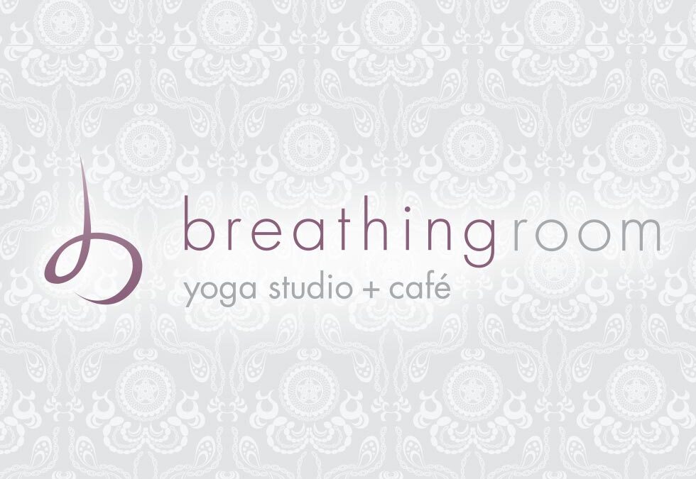
by rpc_7b0ltl | Mar 10, 2013
This identity had a simple goal – visually represent exhaling. Sounds simple, right? The mark and font face are light and open giving a fresh open feel. The mark itself is both a lower case ”b“ and an ”asana“ yoga pose. One highlight was working with the amazing...
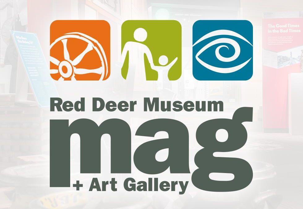
by rpc_7b0ltl | Jan 10, 2012
2012 Logo Refresh Once in a while a designer has an opportunity to be a part of something grand in their community. Being a part of the re-branding of the Red Deer & District Museum & Archives – now named the Red Deer Museum + Art Gallery – was one...
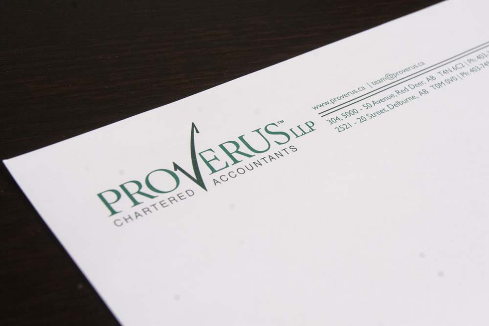
by rpc_7b0ltl | Mar 10, 2010
We created an identity for a new formed accountancy in Red Deer. The name changed half way through the project, which resulted in a bit of a do-over, but the project was better for it. The name is a fusion of some latin (verus) and english (pro). Being an accountancy,...
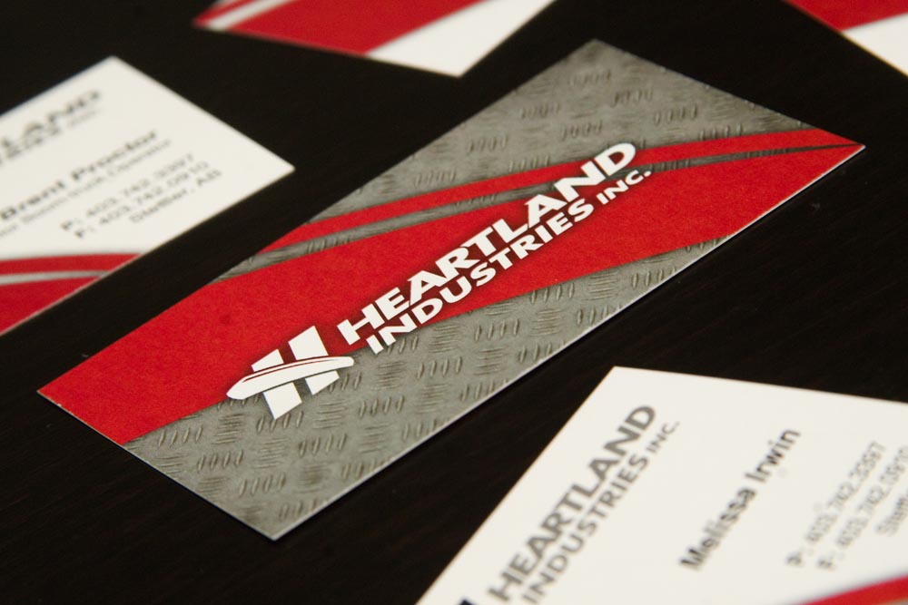
by rpc_7b0ltl | Mar 10, 2009
Heartland Industries in the major player in boom trucks serving the oilfield pump jack market in Central Alberta and beyond. We created a new identity that reflected a hint of the 30+ year history of this family business, Heartland is a third generation family...
by rpc_7b0ltl | Mar 10, 2007
McLevin Industries (formerly McLevin’s Welding) is one of Red Deer’s oldest family-owned businesses. As the next generation prepared to take over, we were asked to revitalize the corporate identity. We created a strong new logo which represents a stylized...