by rpc_7b0ltl | Apr 9, 2018
Friends Phil and Kristi Lund have been working on they e-business “alloutkids.com” for a couple years and finally the time came to design a proper logo. The logo is simple, and is designed to make a really good window or bottle sticker. Project Details Client: All Out...
by rpc_7b0ltl | Nov 28, 2015
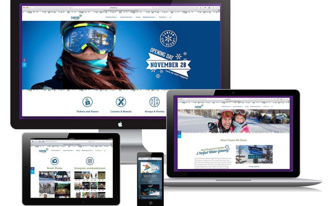
One of central Alberta’s most treasured recreation facilities is Canyon Ski Resort. Back in 2015, we got to re-develop their website and, partnered with a colleague from Whistler Blackcomb, re-mapped the content into a more modern sitemap. In addition, we added...
by rpc_7b0ltl | Mar 10, 2013
This identity had a simple goal – visually represent exhaling. Sounds simple, right? The mark and font face are light and open giving a fresh open feel. The mark itself is both a lower case ”b“ and an ”asana“ yoga pose. One highlight was working with the amazing...