by rpc_7b0ltl | Mar 10, 2013
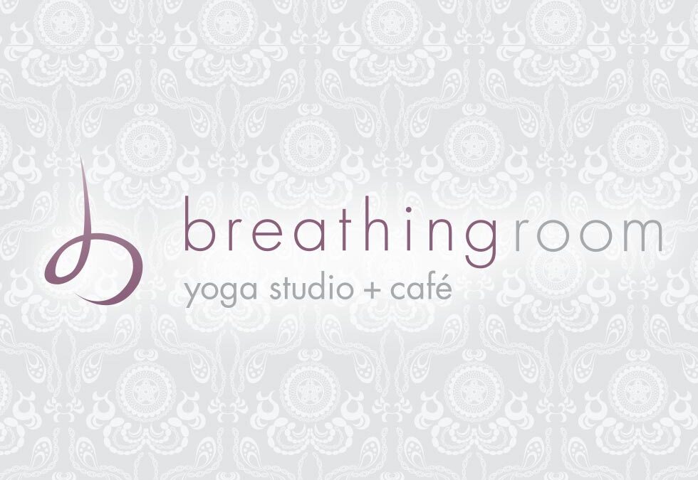
This identity had a simple goal – visually represent exhaling. Sounds simple, right? The mark and font face are light and open giving a fresh open feel. The mark itself is both a lower case ”b“ and an ”asana“ yoga pose. One highlight was working with the amazing...
by rpc_7b0ltl | Mar 9, 2013
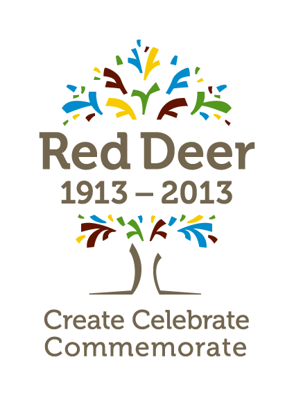
Some opportunities come around once in a hundred years. Red Deer’s centennial logo for 2013 is one of those, and we were honoured to be selected to design the logo to commemorate the events and festivities for 2013. The logo is both fireworks, and a tree. Fireworks...
by rpc_7b0ltl | Jan 10, 2012
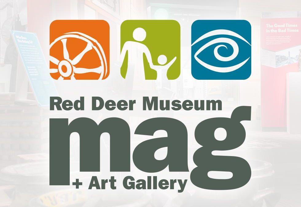
2012 Logo Refresh Once in a while a designer has an opportunity to be a part of something grand in their community. Being a part of the re-branding of the Red Deer & District Museum & Archives – now named the Red Deer Museum + Art Gallery – was one...
by rpc_7b0ltl | Mar 10, 2010
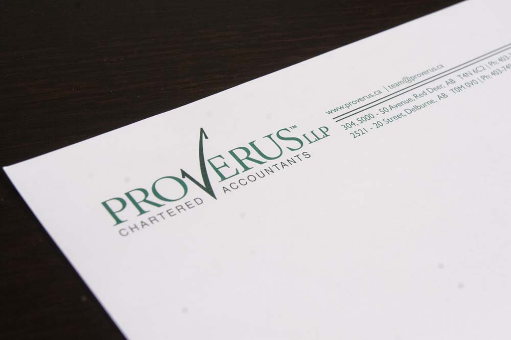
We created an identity for a new formed accountancy in Red Deer. The name changed half way through the project, which resulted in a bit of a do-over, but the project was better for it. The name is a fusion of some latin (verus) and english (pro). Being an accountancy,...
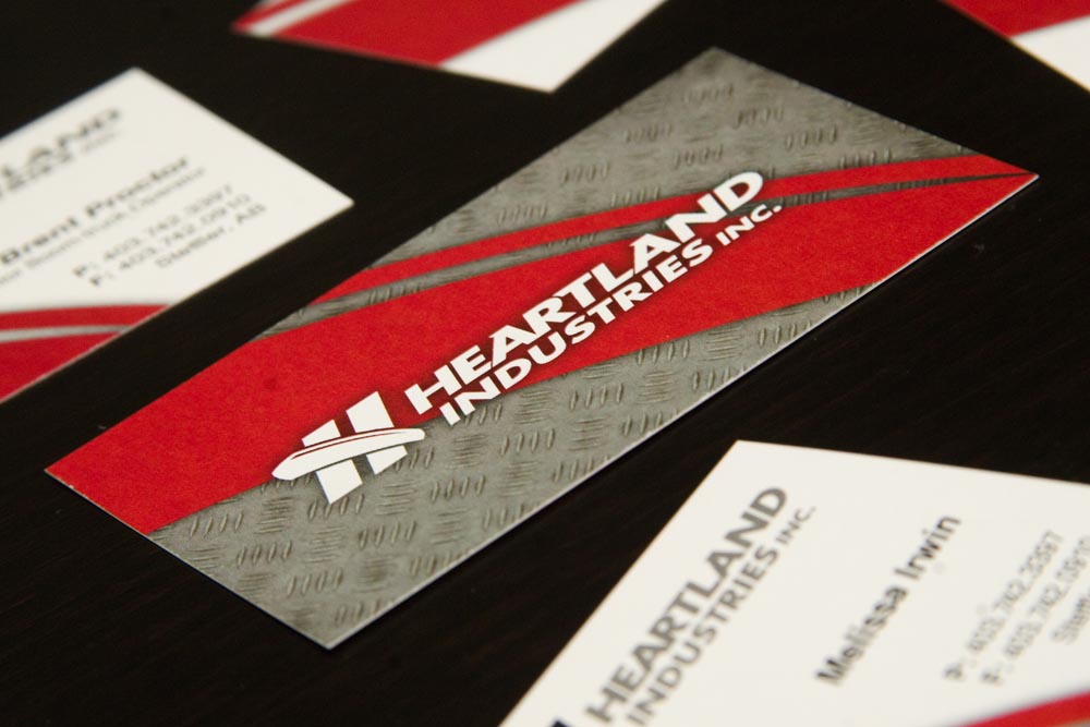
by rpc_7b0ltl | Mar 10, 2009
Heartland Industries in the major player in boom trucks serving the oilfield pump jack market in Central Alberta and beyond. We created a new identity that reflected a hint of the 30+ year history of this family business, Heartland is a third generation family...